5 Ways to Build Engagement on Your Website
This article was originally published in Fast Company.
Last Wednesday morning my 12-year-old son and I accidentally climbed a nearby mountain called Sunset Peak. Elan and I meant only to walk up a little way, scouting the thing out for a possible climb on Saturday. But two hours later, we were at the top, thirsty, out of breath, and delighted. What happened? Why did we abandon our plan of a short leisurely stroll in favor of a hard and demanding hike?![]()
We couldn’t stop climbing because of all the immediate positive feedback.
Once we began our ascent, we discovered something: with every step the view improved. At first, the phalanx of 12 huge water tanks that we passed on our way to the trail shrank to Lego size. Then the road we walked up from our house ribboned down the hill and out into the valley. We argued about which was our house (Elan turned out to be right), and gradually rose to a point where we could view the Drakensberg Mountains farther to the south than we had ever seen them before.
By the time we were halfway up, we could see the summit. And although I had skipped breakfast and felt a bit shaky, there was no way I was going to turn back. Elan agreed, and skipped on ahead as I trudged and stumbled my way behind him. When we summited at 11:15, we just sat in wonder for a few minutes at the 360-degree vista and our own accomplishment.
Immediate Positive Feedback Online
So what does this have to do with your website? Plenty, if your website serves a business purpose. You need new visitors to take a certain action as a result of their visit. Depending on your business model, the action might be to purchase online, fill out a lead or request for quote form, like you on Facebook, call you, or print a coupon and drive to your physical location.
Take a second and think of the most desired action on your website. That’s your summit. How can you entice your best prospects to climb all the way to the top?
Case Study: Ring Central
RingCentral.com offers cloud-based telephony to small businesses. Their service is robust and complex, with hundreds of features, many of which require setup on the part of the customer. The Ring Central mountain takes a fair amount of time and effort to climb all the way to the top. So let’s look at how the website chunks the climb into manageable segments, each providing its own immediate positive feedback.
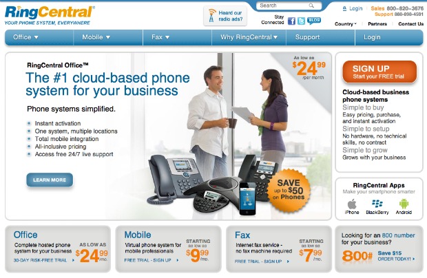
First, the most desired action on the home page is not a purchase, but a free trial. The most prominent feature on the page is the red-orange SIGN UP button, which you see as your follow the man’s gaze past his attractive co-worker.
Just as Elan and I wouldn’t have taken the first step if our only option had been to summit Sunset Peak, my company Vitruvian probably wouldn’t have made the leap to Ring Central without the zero-risk, low-commitment trial.
The five bullets on the left focus not on the ultimate benefits of Ring Central, but rather on the ease of use. Simple pricing, instant activation and free 24/7 live support are all designed to make the mountain seem easy to climb. These are the trail signs at the bottom of the mountain. The first step up the mountain is the “learn more” button just below those bullets.
That button takes you to a page describing the most important features and benefits of Ring Central under two main headings, Making Calls and Receiving Calls.
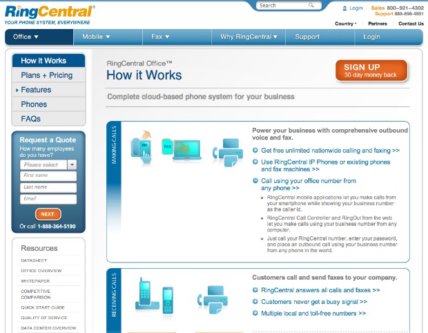
Clicking the plus sign next to each high-level feature expands the section into three or so detailed sub-features. You’re invited to climb the Ring Central mountain step by step, with each step delivering more value than the effort required.
At any point in the sales process, you can press one of the “Take me to the top” buttons; on the interior pages, the “sign up” button is joined by a “next” button at the bottom of the “request a quote” box on the left.
Notice that the ultimate goal of the website is just the first mountain in a series of ever-higher peaks. Once you sign up for the risk-free trial, Ring Central follows up with email tutorials and customized progress reports that help you set up the key features, so you convert to long-term paying customer. From there, you are presented with a series of logical upsells to bigger, more robust, and more expensive plans.
Implementing Immediate Positive Feedback
Here are four elements that you need to implement immediate positive feedback on your website:
1. Know what your prospect wants when they first arrive at your site.
Too many websites focus entirely on the benefits of the top of the mountain. They ignore the importance of the small first steps. Elan and I just wanted a pleasant walk. Ring Central prospects want a phone system that works right away, with minimal effort and cost.
What do your visitors want at first? Reassurance that they’re in the right place? Confidence in your capabilities and ethics? Answers to their pressing questions? A phone number so they can talk to a live human being? Empathy?
Make a list of the initial requirements of your visitors and design landing pages that acknowledge and deal with those requirements before you start touting the view from the top of your mountain.
2. Be clear what you want your visitor to do.
Ring Central doesn’t try to get prospects to sign multi-year, multi-employee contracts on their first visit. The mountain they want new prospects to climb is the 30-day trial.
What’s the first mountain your visitors must climb before they can do business with you? Is it a sale? Or can you decrease the height and slope of the first mountain by asking for a name and email, or a software download, or a phone call, or some other intermediate step?
Behavioral economists point out that humans will do much more to prevent loss than to achieve gain. The more you can decrease your prospects’ perceived risk and effort, the more likely they are to take you up on your offer to begin climbing.
Determine the smallest mountain you can define that still gives you the ability to follow up with your prospects after their initial visit.
3. Use visual cues.
Once you’ve identified the first mountain, design your site so that every pixel reinforces that action. Ring Central uses color contrast to highlight the action buttons, as well as positioning them in places that already attract eye gravity. Humans follow others’ gaze; the man’s eyes on the home page directs our eyes to the “sign up” button.
On the features page, the “request a quote” box is a darker color than the rest of the page. The plus sign next to each feature is a widely recognized convention for “There’s more here if you’re interested.”
And while the Ring Central site contains a lot of information, the design divides it into manageable chunks, so that each step appears easy to take.
How can you visually identify both the top of the first mountain and the steps visitors need to take to progress toward that peak? How can you use color contrast, white space, and images to help your visitors see the path and want to follow it?
4. Give clear directions.
The trail that Elan and I climbed was well marked with signs at the trail head, at the junctions of other trails, and with blazes along the way. Also, it was well-maintained throughout; we never looked around and wondered which way to go next.
The Ring Central buttons describe where they take you: “sign up,” “learn more,” and “next” all indicate why you should click and where you go once you do. On many websites, too many buttons and hyperlinks are of the Alice in Wonderland “Drink Me” variety: you don’t know where you’re going or why. The default “submit” button sounds more like a call for surrender than an invitation you can’t refuse.
5. Test continually.
These four elements are grounded in empathy; striving to understand what your prospect cares about, desires, and fears. The second half of the equation is curiosity; an eagerness to find out if you’re right.
Online, curiosity is best operationalized by tracking visitor behavior on your site and testing variations to see which one provides the most compelling and simplest path up your mountain.
Here’s the Ring Central home page on March 17, 2010:
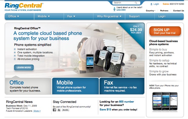
While much of the page is identical, the photograph has changed, and there’s more white space. The Mobile and Fax areas are lighter in tone, allowing the “sign up” and “learn more” buttons to stand out more on the page.
Make a list of things you can test on your site. Start with the big ones: headlines, overall design, color schemes, wording of buttons. Next, test the order and number and text of bullets, body copy, and text font and color.
Don’t be formulaic–let your tests derive from curiosity about what makes your mountain easy and appealing to climb.
If you want more people to start climbing your mountain and make it all the way to the top, think like your prospects and make each step immediately worthwhile so they’ll want to take the next one.
Otherwise, they’ll surely take a hike.